1. New Carousel Layout in the Hero Web Part
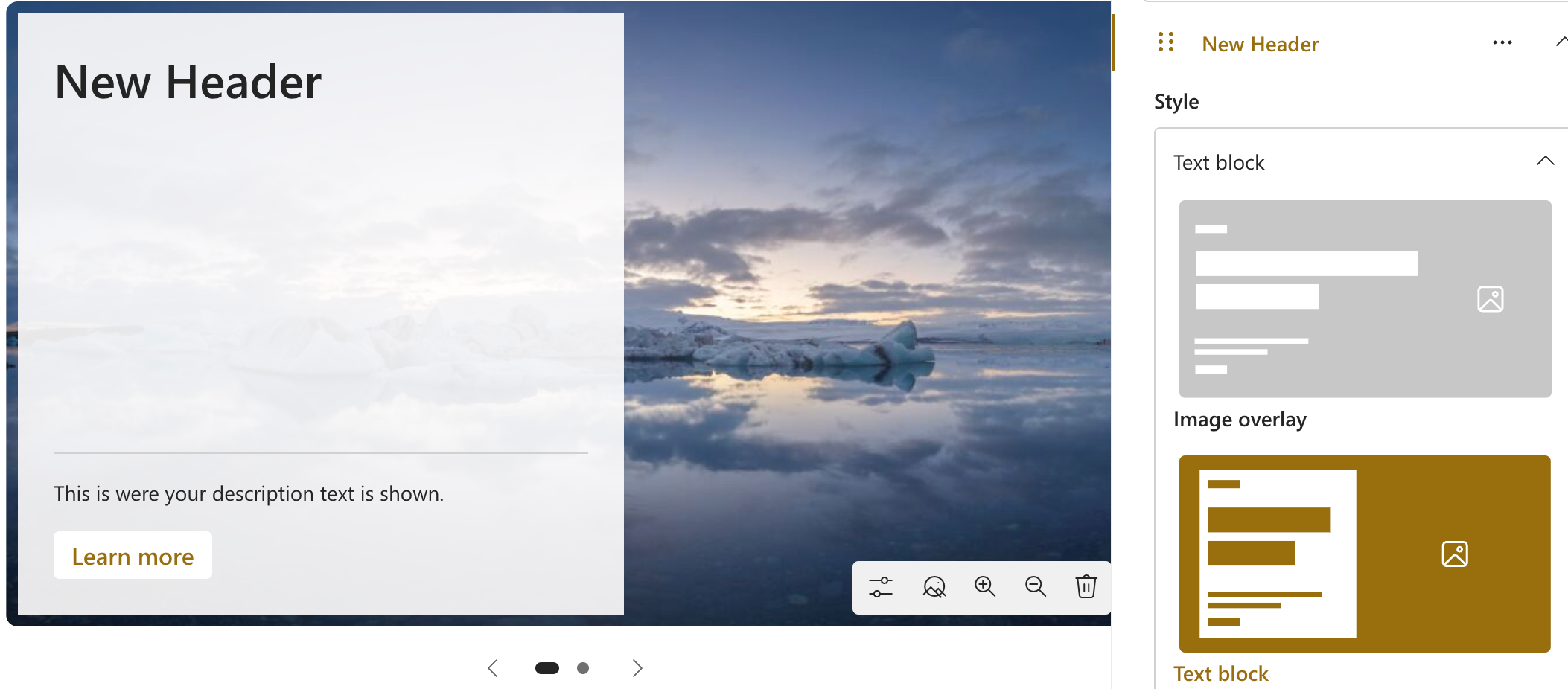
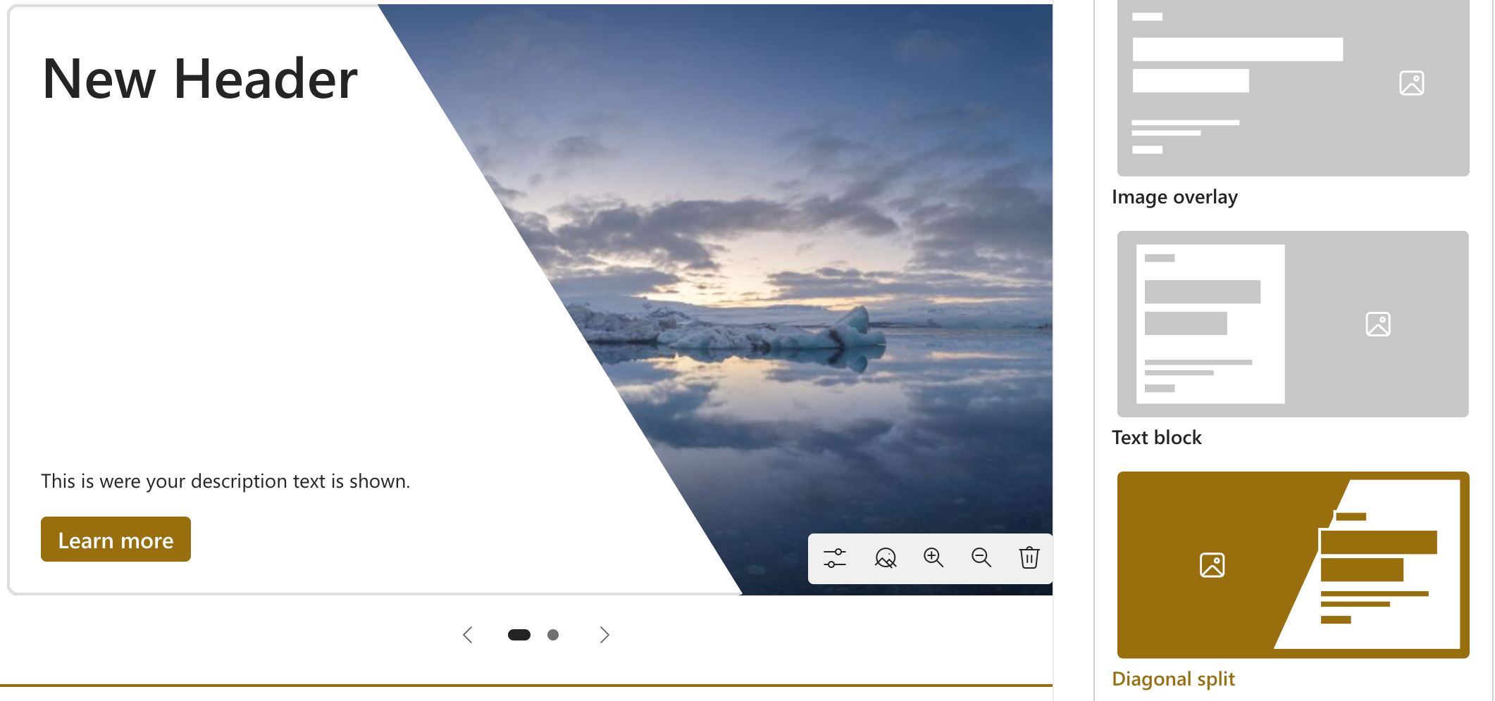
The Hero Web Part has always been a fundamental element of SharePoint pages. The new Carousel Layout enhances its functionality by enabling users to showcase multiple items in a rotating slideshow. This feature is ideal for highlighting important announcements, promotions, or featured content.
Step-by-Step Instructions
-
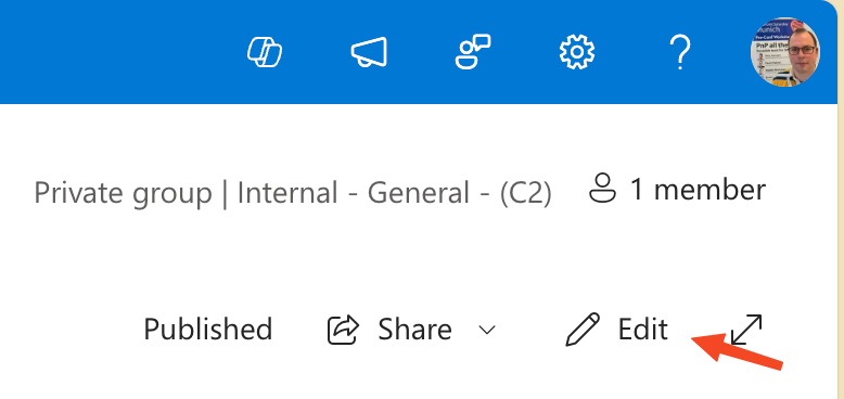
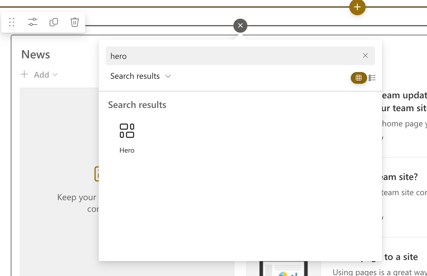
Add the Hero Web Part
-
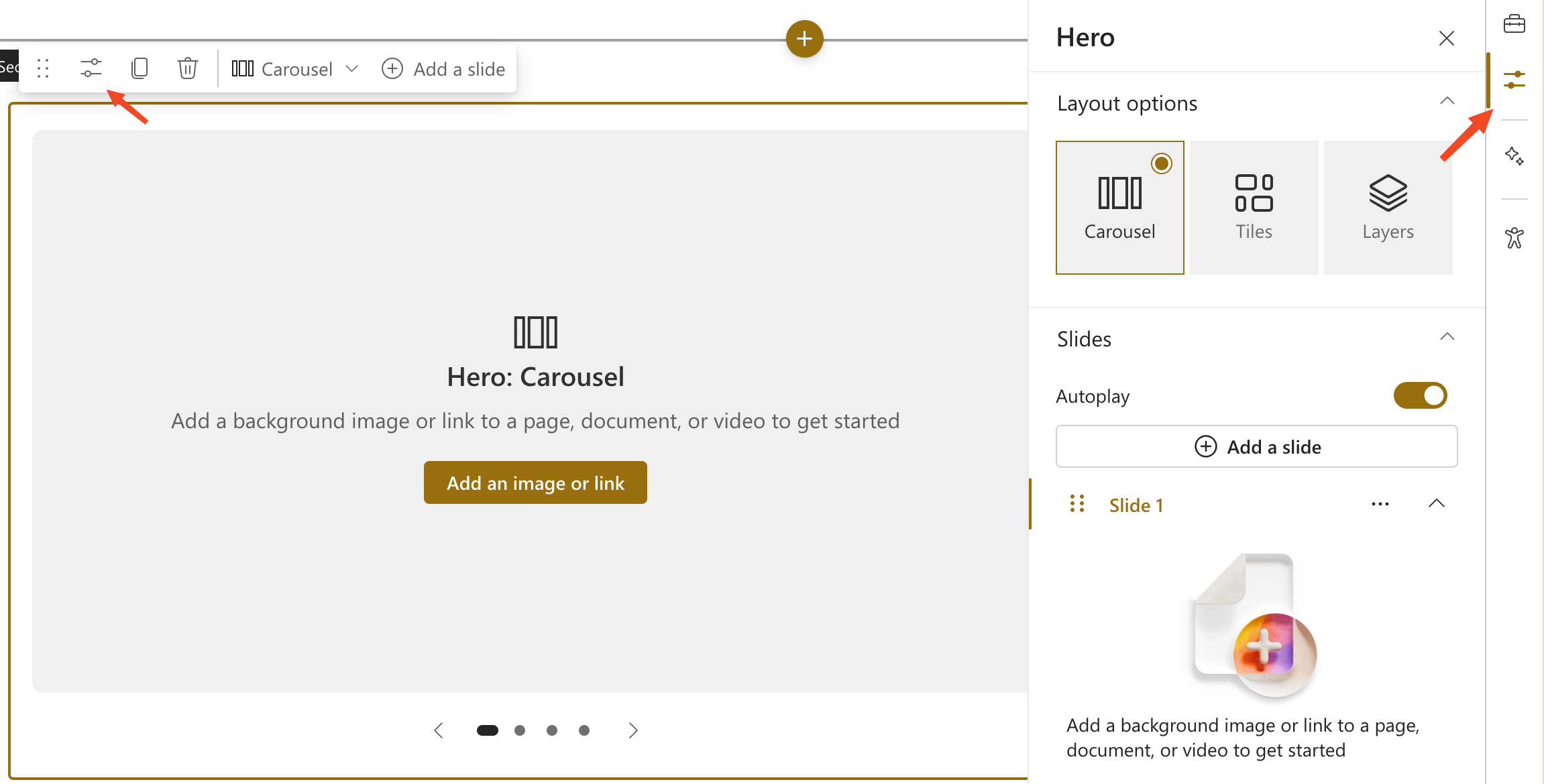
Select the Carousel Layout
-
Add Slides
- Click Add a slide to create up to five slides.
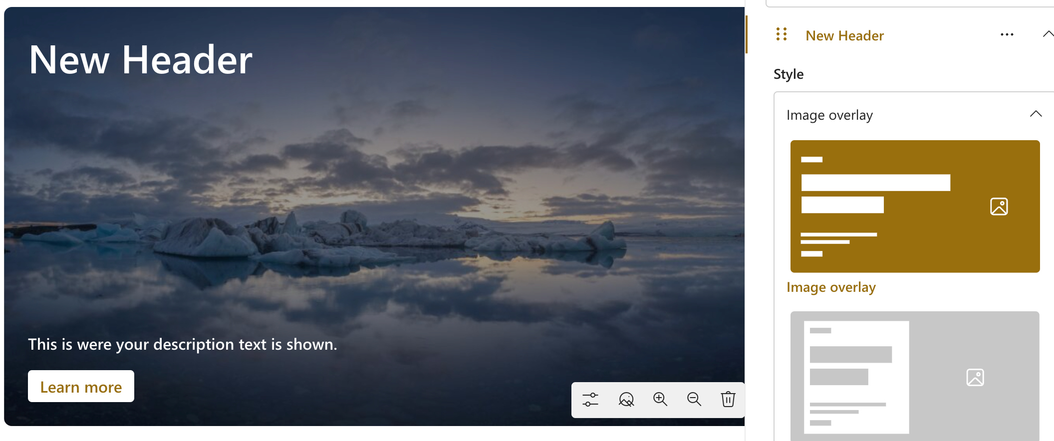
- For each slide, you can:
- Upload an image or select one from your library.
- Add a Topic (up to 40 characters), Header (up to 110 characters), and Description (up to 500 characters).
- Include a Call to Action (CTA) button with customizable text.
-
Customize Slide Settings
-
Enable Autoplay
- Toggle Autoplay in the Property Pane to automatically cycle through slides.
-
Publish Your Page
- Once satisfied with your Carousel, click Save as draft or Publish to make it live.
2. New Editorial Card Web Part
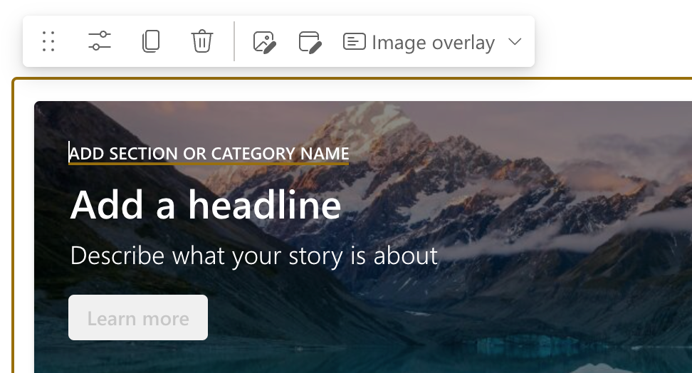
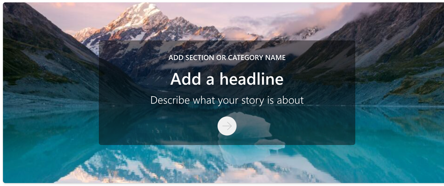
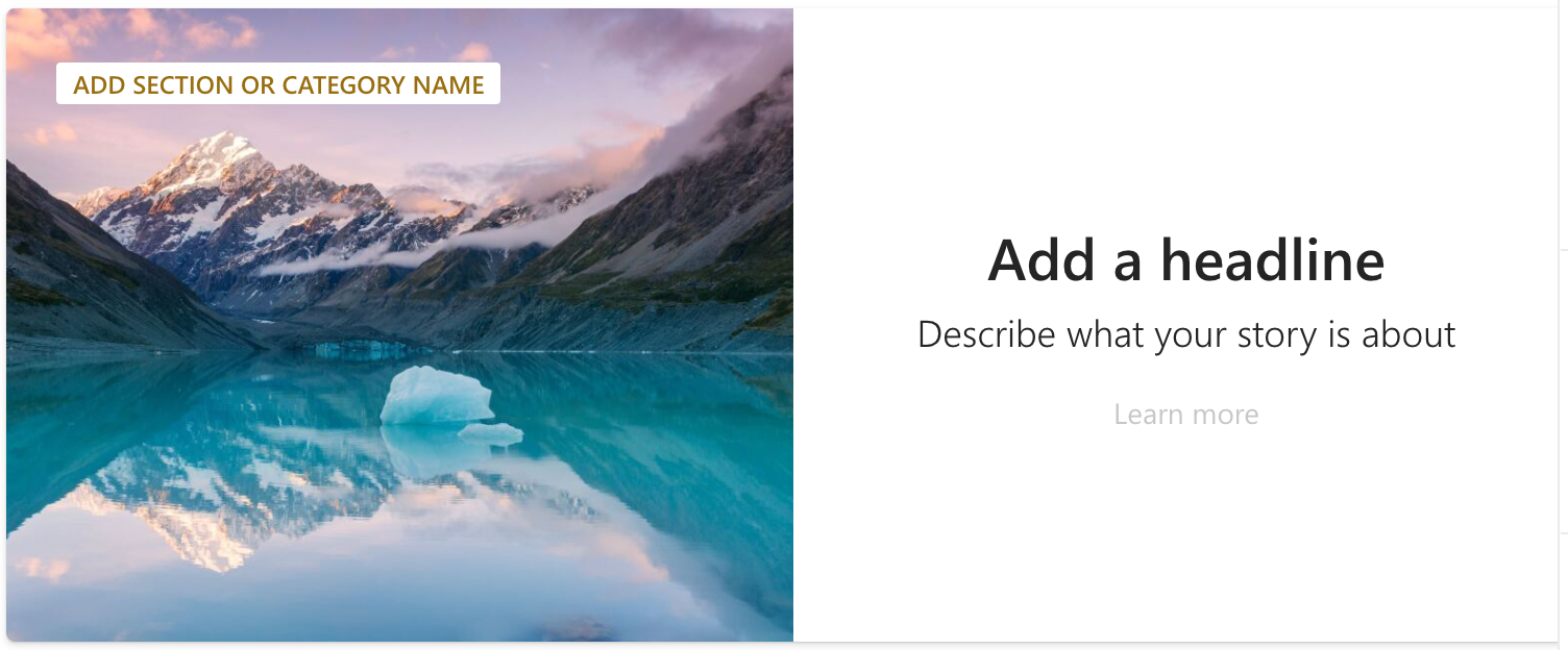
The Editorial Card Web Part significantly enhances content creation. It allows for manual customization to display content in an engaging card format. This feature is perfect for highlighting announcements, articles, or any content requiring a unique presentation.
Step-by-Step Instructions
-
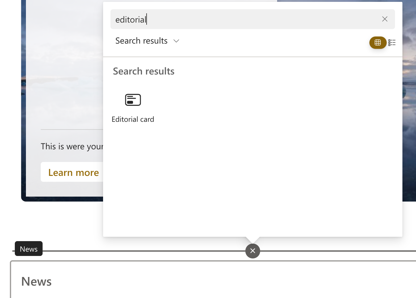
Add the Editorial Card Web Part
-
Fill in Content
-
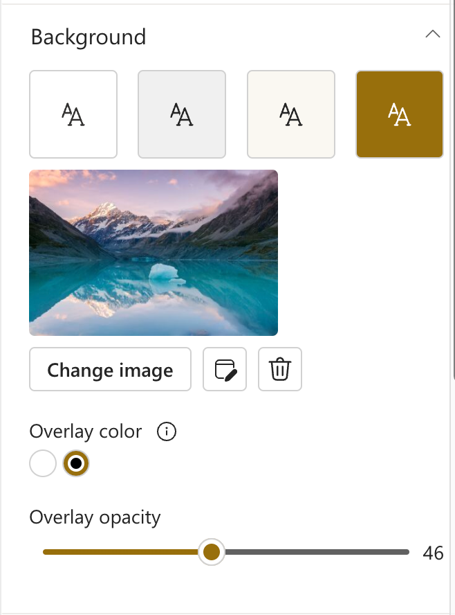
Customize the Background
-
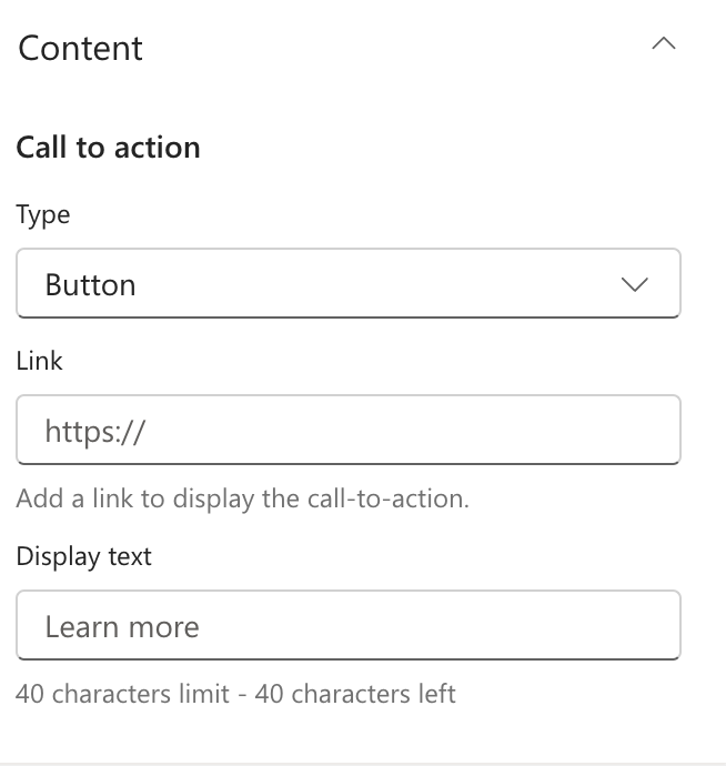
Set Up the Call to Action
-
Choose a Layout
-
Publish Your Page
- Click Save as draft or Publish to make your Editorial Card live.
3. New Focal Point for Images
SharePoint has improved its Focal Point feature, allowing you to crop images more precisely. This ensures that the most important parts of your photos are visible on all devices.
Step-by-Step Instructions
-
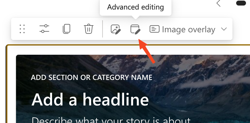
Edit the Page
- Navigate to your SharePoint page and enter Edit mode.
-
Select the Image
-
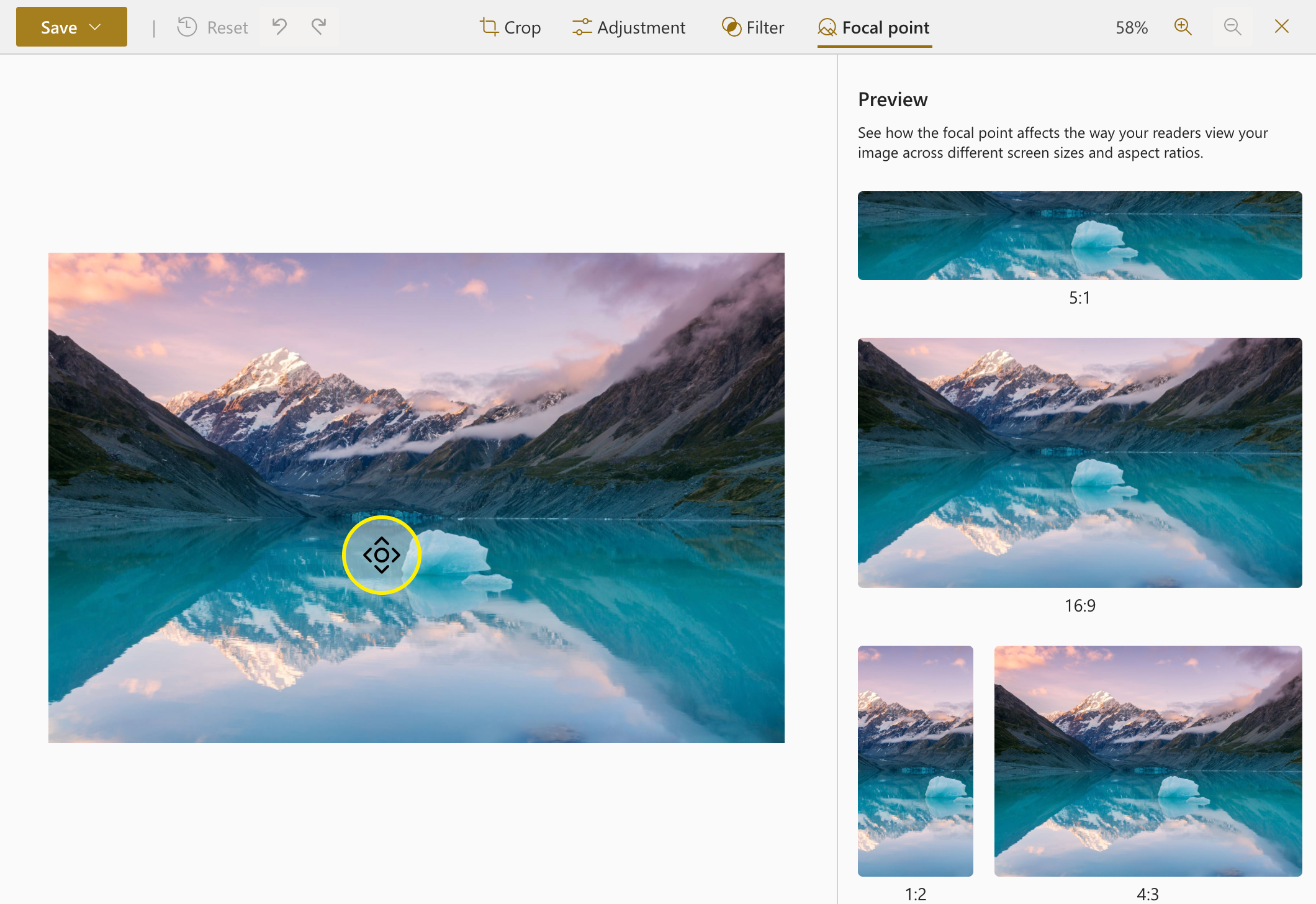
Adjust the Focal Point
- Click the Set focal point button in the toolbar (a circular icon).
- Drag the focal point to the desired location within the image preview.
- Use the preview pane to see how the image will appear on different devices and layouts.
-
Save Changes
- Click Save to apply your focal point adjustments.
- Publish the page to make the changes live.
Availability
- Targeted Release: Mid-January 2025
- General Availability: Mid-February 2025
Are you excited about these new SharePoint page features? Share your thoughts and ideas in the comments below!

